Topic 8: Map Analysis
A map is a form of communication and the process of interpreting map information is the search for 'meaning' or 'message' in the map by understanding the spatial pattern that is displayed. The process of interpretation has to be approached with caution since it is easy to confuse using maps. Difficulties arise in situations where there are coincidental associations between unrelated variables. Sometimes it is not possible to differentiate between cause and effect.
Analytical Process: The process of map interpretation involves analyzing the spatial information that is depicted and the way in which it is depicted. There are several methods of map analysis: intuitive/visual, mechanical, and logical.
Intuitive/Visual: This is where, without being concious of it, we are applying a well-known method, or comparing results with prior knowledge.
Mechanical: This is where a 'cookbook' application of rules is being applied.
Logical: Thinking through the steps and making reasonable assumptions.
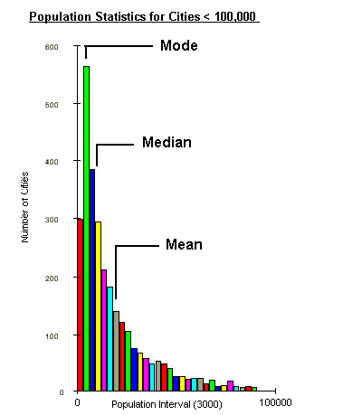
Frequency Distribution Histogram: There are similarities between the distribution of values in a population as displayed in a Frequency Distribution Histogram and a spatial distribution on a map. Three mathematical ideas are represented by a frequency distribution histogram: Mean, Mode, and Median.
Mean: This is the mathematical average of the all the values
in the population.
Median: This is the value associated with the 50% or middle
individual in the population.
Mode: This is the most abundant value in the population
Central Tendency: This is similar to the frequency distribution, but based on spatial location. The centre is the spatial equivalent of the three related mathematical ideas: Mean, Median, and Mode.
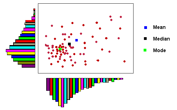
Map Mean: This is the mathematical average of the all the X
and Y values in the population.
Map Median: This is the value associated with the 50% or middle
individual in the spatial distribution.
Map Mode: This is the most abundant location of points in the
spatial distribution
There are two conventional ways of using distance to describe spatial patterns: Density and Cluster.
Density Analysis is the idea of spacing, crowding, or emptiness; mathematically, it is the number of spatial elements that occur in a specified area (i.e. cities per square mile).
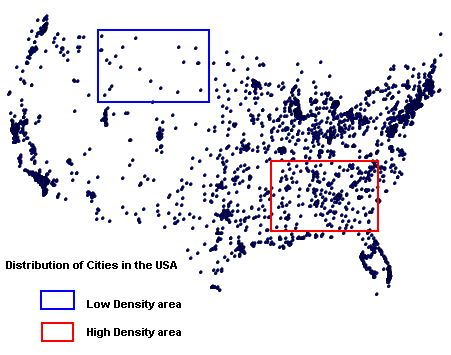
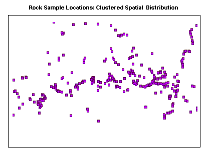
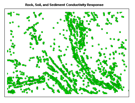
Cluster Analysis is the way in which spatial features are arranged in a map pattern. A spatial distribution may be described as dispersed or if it is irregularly or randomly scattered throughout an area; a clustered spatial distribution is one where the elements are close to one another.
Clustered Spatial Distribution
Dispersed Spatial Distribution
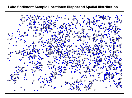
Variance-Mean Ratio: This is a statistical calculation which is used to compare the clustering in one pattern with that in another. It provides a quantifiable method for determining the degree of clustering. For example, in the previous two examples, the clustering is clearly obvious for the distribution of rock samples; the lake sediment samples are much more dispersed, however there is a slight clustering tendency in places.
| Even Dispersion: | Variance-Mean Ratio < 1 |
| Random Distribution: | Variance-Mean Ratio = 1 |
| Substantial Clustering: | Variance-Mean Ratio > 1 |
Directional patterns can be subdivided into those which deal with a directional bias of the pattern as a whole, and directional alignment of the individual elements in the pattern.
Directional Bias: This is when a map pattern has a greater number of spatial elements (i.e. points) in one area over another and it is possible to draw a trend line along the approximate boundary.
Alignment Bias: is the measure if directional trends in a spatial pattern. Individuals in an aligned pattern tend to have neighbors that are much closer.
Line patterns can be analyzed in a similar manner as point patterns, by measuring line density (i.e. lines per unit area), directional bias (i.e. higher concentration of lines in one area versus another), and directional alignment (i.e. general directional trends in the lines).
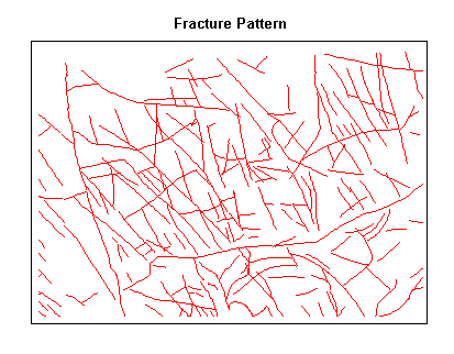
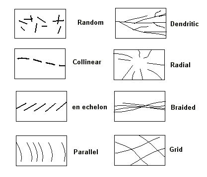
Line Pattern Examples: There are some line patterns that occur commonly on maps; a few are summarized in the figure.
Radial, Braided, and Dendritic Patterns are found in stream
sytems;
Random, en echelon, and Grid Patterns are found in rock
outcrops;
Parallel Patterns are found along shorelines and raised beaches;
Collinear Patterns are not common in nature and can be used to
annotate maps.
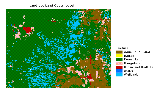
As with point and line patterns, the concepts of density, directional bias, and alignment or orientation also apply to area features. Several area patterns can be observed over a portion of the Chippewa County Land Use Land Cover, Level 1 map:
Area Density: wetlands display a higher density over some
areas compared to others;
Area Bias: the spatial arrangement of wetlands demonstrate an
overall northeast orientation;
Area Alignment: specific areas within the wetlands have an
east-northeast alignment.
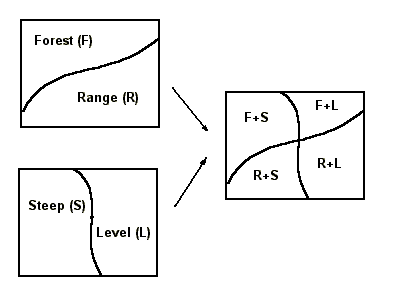
Area map patterns describing different themes can overlap. This provides the map interpreter with an important problem-solving and analytical tool since it lends itself easily to processing by computers.
Area Overlay Qualitative Example: The addition of two themes results in a third theme with a combination of the original areas. When combining many themes, this approach is cumbersome, and so a quantitative method is preferred.
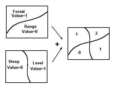
Area Overlay Quantitative Example: By giving a relative value to each of the area features in each theme based on the importance of that feature, it is possible to create a suitability map.
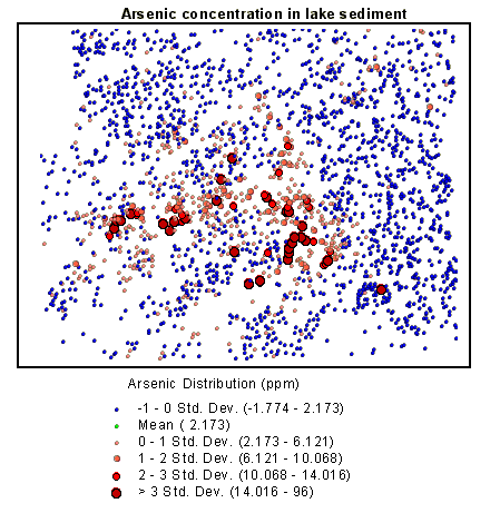
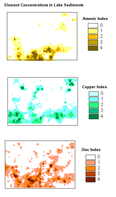
By classifying themes in terms of their suitability in meeting specific conditions and then combining these themes, it is possible to analyse a large number of complex areal themes. In the following example, lake sediments in an area were analysed for copper, zinc, and arsenic concentrations. The various element indexes reflect the 'weight' given to increasing concentration levels. There are similarities in the areal map patterns of each element, but it is visually difficult to determine where there is commonality and where there is not.
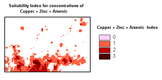
Suitability Map for Cu, Zn, As: The calculation consists of adding the three separate element indexes; those with the highest values reflect high concentration of all three elements. In producing the final map all the totals are divided by three (three maps) to normalize the data.
One of the reasons we use thematic maps is to compare map patterns. This can be done visually in a qualitative sense, as we have noted earlier, or in a quantitative or measured comparison. The amount or degree of corellation between the map patterns can then be displayed as a chart and determined mathematically.
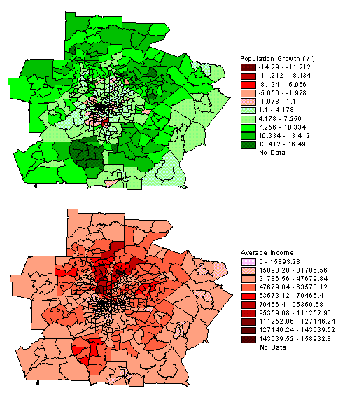
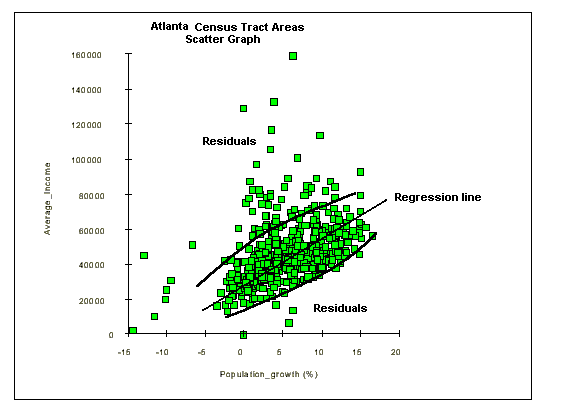
Map Pattern Correlation Example: The following map patterns are based on demographic information for the city of Atlanta, Georgia. The area is subdivided into census tracts or subareas with information on population growth and average income. In both patterns there is evidence of some radial bias in the data; population growth is negative in the core, increases radially outward, and then decreases slightly; average income is low in the core, increases radially outward, and then decreases
Graphic Correlation: Since each census tract contains information on average income and population growth, it is possible to plot one variable against the other in order to visualize any correlation. Although much of the data falls into one cluster, there is some linear positive correlation between positive population growth rates and increasing average income.
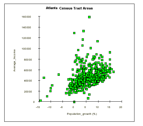
Regression Lines and Residual Data: Residual data points are those that do not fall within the main trend. The residual data is defined as the data points which fall outside the grouping defined by the regression line and its outer boundaries. It is possible to map the residual data to try and explain the reason for the variance from the main trend. In this example, one factor which may explain the residual population is that a high average income does not appear to correlate with high population growth.
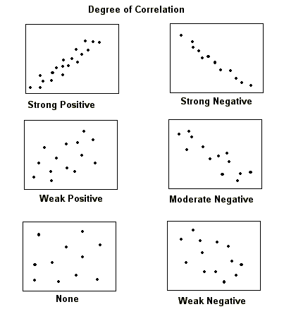
Degree of Correlation: Variables may be positively or negatively correlated, or not correlated - displaying a random distribution of point. In a positive correlation, as one variable or factor increases, the second variable also increases and the regresion line has a positive slope. For a negative correlation, as one factor increases, the other decreases and the regression line has a negative slope.
Gershmehl: p. 101 - 144
Monmonier: p. 43 - 57
p.
71 - 86
p.
139 - 162