Topic 7: Map Interpretation
Maps are graphic representations of the real world and a way of communicating spatially related information about the world we live in. Map makers have classified map products into two broad categories that reflect these two concepts in the form of Reference Maps and Thematic Maps.
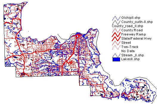
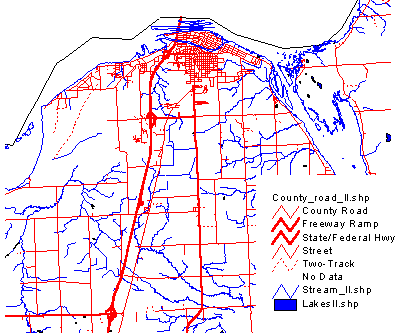
Reference Maps are a representation of features such as rivers, lakes, roads, topography, cities, etc.
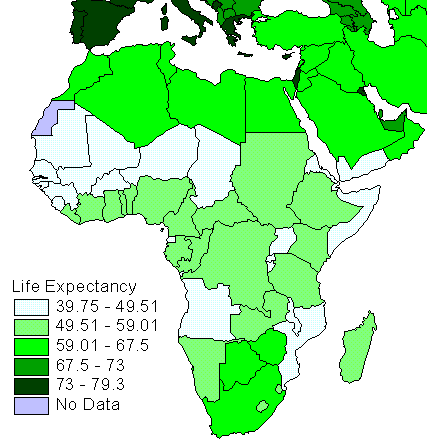
Thematic Maps are maps which focus on a feature and display its spatial pattern accurately. The example demonstrates the variation in life expectancy (years) in the Africa and portions of southern Europe and the Middle East.
The graphic language that we use to represent information about the world, whether it is thematic or referential, consists of points, line, and area symbols.
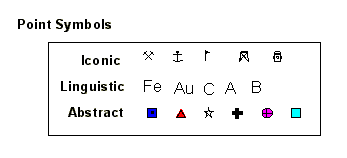
Point Symbols can take the form of dots, circles, letters, icons, pie graphs and represent the locations of features, depict relative magnitude.
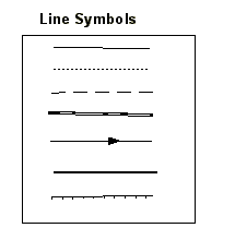
Line Symbols take the form of lines, dot strings, double lines, contours, hatched lines and represent linear elements such as roads, streams, etc.
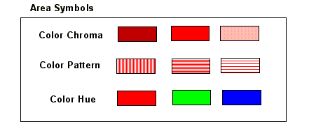
Area Symbols take the form of shading, coloring, crosshatching, and dot patterns, and represent features such as uniform regions, identify areas with common traits, to identify areas entities (ie. counties, states, etc.).
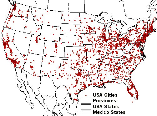
Point Symbol Data example showing the distribution of cities in the United States.
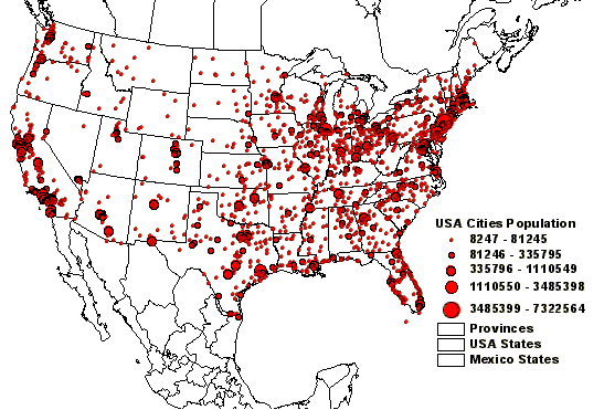
Graduated Point Symbols can be used to depict increasing magnitude, such as city population in the following example:
Graduated Line Symbols can be used to depict size and significance, such as road networks.
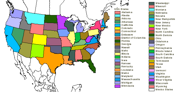
Area Symbols can be used to depict qualitative variations between areas on a map, such as the different states.
These types of maps are a way of representing quantitative (i.e. numeric) information between spatial units such as, states, counties, census tracts, forest stands, geological units, etc. The information being represented could be population statistics, demographic data, geologic age, tree age, etc.
Data Classification: choropleth mapping aggregates data by grouping areas within a range of data values into a single category represented by a single symbol. There a different methods of classifying numerical information, such as: Equal Interval, Quantile.
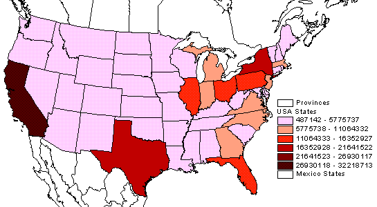
Equal Interval Data Classification: In this example, the population of states has been subdivided into 6 equal intervals, each with increasing ranges in the population. Most of the States fall into the lowest range, with California being the onlly one to fall within the highest range. Choropleth maps make it possible to quickly asses the spatial relationships between population and location.
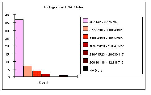
Equal Interval Chart: The chart is based on the Equal Interval Classification used for the State Population map. Note that the lowest population range has the highest number of states, and this decreases with increasing population range.
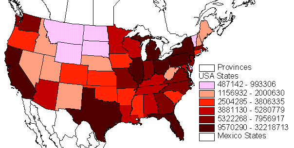
Quantile Data Classification: This method of data classification subdivides the data into several classes (generally 4 or Quartile), such that each class is assigned the same number of features (or as close as possible). In the example the 9 states with lowest population fall into the lowest class range; the 8 states with highest population fall into the highest class range.
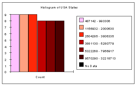
Quantile Chart: The chart is based on the Quantile Classification used for the State Population map. Note that the lowest population ranges each have 9 states, the highest three population ranges have 8 states. This is due to the fact that 51 states cannot be divided evenly into 6 intervals.
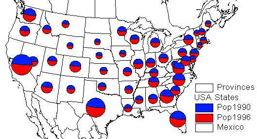
These are maps which show a changes in a particular variable through time. The manner in whcih the changes are displayed can vary depending on the symbology that is used. For example changes in the population of States in the USA can be described using a pie symbol; the size represent the relative increase in population from 1990 to 1996 between each state, and the pie slice represents the increase within a state.
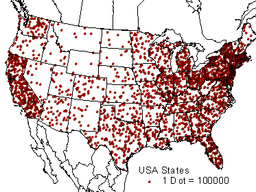
A dot density maps symbolize areas (or polygons) using dots inside the area to represent a value such as population. Each dot represents a specific value such as 100,000 person per dot. The dot location is selected randomly and does not represent a specific geographic location.